

Have a website and want to make it mobile friendly, or simply have a mobile website and want to improve its usability? According to Baymard, by the end of 2021 over 56% of ecommerce shoppers will be from mobile users. Large companies are all planning to access the next billion, currently over 54% of web traffic coming from mobile (Statista), and the majority of traffic from developing countries coming from mobile users, this number is likely to grow more mobile heavy in the next few years.
The need to adapt to mobile is greater than ever before, but adapting your desktop website for mobile can be difficult and if not done correctly, can be harmful for your brand. This guide will help you create a fully mobile friendly website, ensuring any mobile visitors will want to use your website to purchase your products and services, while your competition falls behind.
Navigation
Let’s start off with the foundational navigation, this is naturally going to be different from a desktop website because of how users interact with the device – touching a vertical screen, as opposed to using a mouse on a horizontal screen.
Websites often use horizontal navigation bars at the top of the page in the header, with the ability to navigate to categories and subcategories. Here are some example categories: About, Pricing, Products, Contact Us.
The other two common desktop navigation types are: dropdown navigation menus and the vertical sidebar menu.
So, how can you design a completely different navigation system for mobile, when your website has different navigation?
The two main mobile navigation types are: Hamburger menus or Tab Bars.
- A Hamburger menu is common when you want to present your homepage without distracting users with links, you can have a small menu icon in the top left (usually) for users to open and get access to links and other parts of the website. There are less links, less navigation points on the pages to be distracted by and more space for users to remain focused on.
- Tab Bar navigation is visible on every screen, stuck at the bottom of the screen, with often 3-5 icons, ready for users to press to go to sections of the website. The most common example is Instagram, with 5 main icons in its Tab Bar. This can be useful when your website can be split up into 3-5 main categories, but can become difficult to use if there are more sections than 5, because they need to fit into the predefined tabs, and the whole navigation becomes messy – “which tab do I put this section in?”.
So, Hamburger menus are useful for when you have lots of navigational links but want to hide them from the page. Tab bars are useful for websites with a few main functions and sections to the website and where the user can quickly jump between these sections. As a result of less space for navigation, always include a search box in case a user is con
Here is a comparison:
These have distinct differences, but the major difference is that Ignant has been able to move its top navigation bar from its website completely into its hamburger menu, while Binance has chosen to limit users to navigate through 3 main functions through its simple 3 icon tab bar. Choose what fits your website and users needs.
Additional Navigation Features
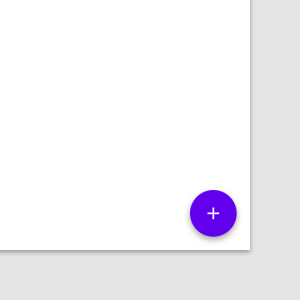
Then there are additional navigation features you can add: a FAB (floating action button) or even making your tab bar adaptive.
- The FAB can be added to either a Hamburger menu or Tab Bar, and it gives you additional actions to take depending on the page the visitor is on. By using a FAB, the user can remain focused on the page and while still having available actions without needing to interact with a large navigation menu or bar.
A good example of this is the Compose Tweet button on Twitter, but is also commonly used by many ecommerce websites for starting a chat with an assistant. If you need more navigation, you can have several sub FAB’s inside the main FAB so your users have multiple actions available coming from the FAB.
- An adaptive Tab Bar is useful and can help a website create a tailored experience. As the Tab Bar is stuck to the bottom of the webpage, you can adapt the Tab Bar to change once you go inside a section of the app. This can be useful for categories and subcategories, with the Tab Bar keeping certain tabs constant (such as Home or Account), and adapting others to your location on the site.
Interacting with buttons
Users interact with touch devices in a very different way to how they would interact with a mouse. Hover menus are commonplace across the web, most websites with horizontal bar navigation use hover actions to open up categories and subcategories. Here on Jorik, customers hover over an item to see that item’s details – price and product name. On mobile this wouldn’t work – users wouldn’t be able to see any price or product name without pressing and going into the products page. Make sure your website’s main interaction changes from hover to hard press. This seems small but it changes the fundamentals of your website and how usable it is.

On Amazon, they have changed their desktop website from a hover interaction to hard press targets to align the desktop experience with the mobile experience. In the short term this changed the fundamental way users interacted with their website, but quickly they streamlined their user experience and made both their work simpler, and the UX more usable at the same time.
Visuals
Due to the limited space a mobile screen can offer, remove any distractions to the user. Keep the user focused on the goal of your website – on a desktop it is easier to not limit your screen real estate because you can fit all the elements you want onto one page, but on mobile you only have a limited amount of space and have to choose wisely. Limit the number of elements to around 3-5 on the initial visible section of the homepage: a headline, subheading, image and CTA.
Keep it simple, clear, concise, don’t add features that are not used, take up space and resources only to reduce the overall usability of the website.
User Navigation & Testing
Being thoughtful with your design is important, this isn’t simply about changing it from horizontal to vertical orientation. When designing websites, there are many options out there but I generally use Mockplus because I can save time using their built-in interactive component library (tables, lists, panels, buttons and more) but their storyboard feature is also useful.
I find that having an overview of the pages helps me test my website out by by going through the website page by page as a user would, and optimizing my mobile website from there – ensuring that page links are correct, there are no extra page links that can distract the user, and that there is no desktop only functionality that I’ve not taken out.
Little details to consider:
Responsive design – can your website scale easily to a variety of mobile screen sizes? Check components (buttons, tables, lists, navigation menus) and media files, make sure they resize automatically to the size of the screen.
Animations – do they slow down the speed of your website, detracting away from the overall experience?
Autoplay – make sure any video’s autoplay is turned off. People are afraid of using mobile data or that a video will suddenly start blasting out audio.
User flow – is it as fast as on a desktop with a mouse?
Every aspect mentioned above is crucial in ensuring your mobile website is useful in creating loyal customers and users. Ensure your websites are as good as they can be to truly show off your products or services.
Mobile website design is different and by understanding the above fundamentals. Create prototypes, follow the above mentioned guidelines and test your designs out internally, test them on users. By doing so, you will be able to capture the mobile market.